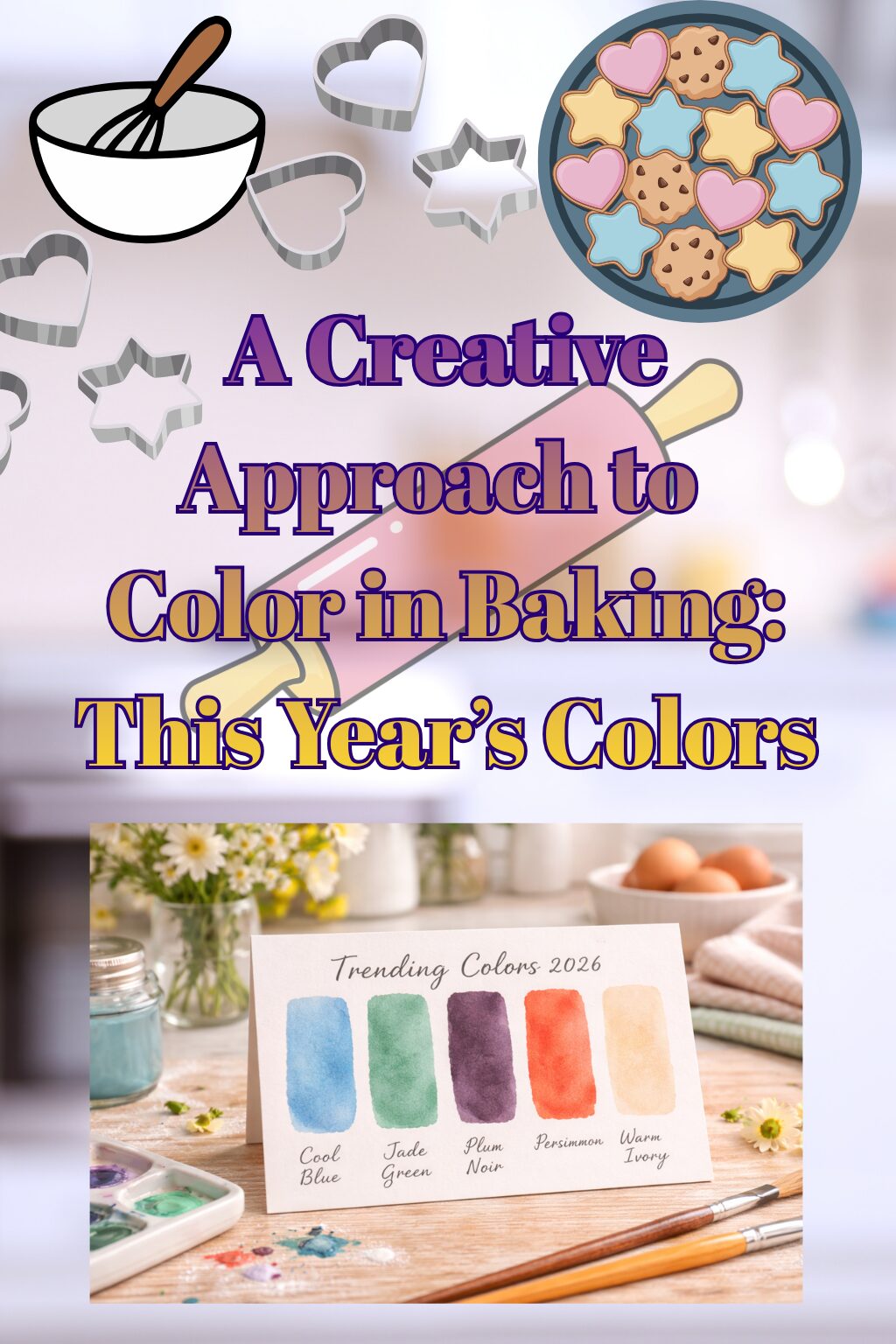
A Creative Approach to Color in Baking: This Year’s Colors
This post may contain affiliate links.
If you’re wired creatively, you already know this:
color shows up before words.
Before a flavor is explained.
Before a texture is described.
Before someone even knows why they’re drawn in.
Color lands first.
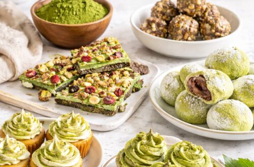
That’s true in painting, and it’s just as true in baking — especially when frosting enters the picture. Cookies are small, sure. But they’re still surfaces. Still compositions. Still moments where color decides how something feels before it’s ever tasted.
Taste is the goal — always.
But color is the invitation.
And if you’re someone whose brain is constantly sorting, pairing, imagining, adjusting — color isn’t an afterthought. It’s the language.
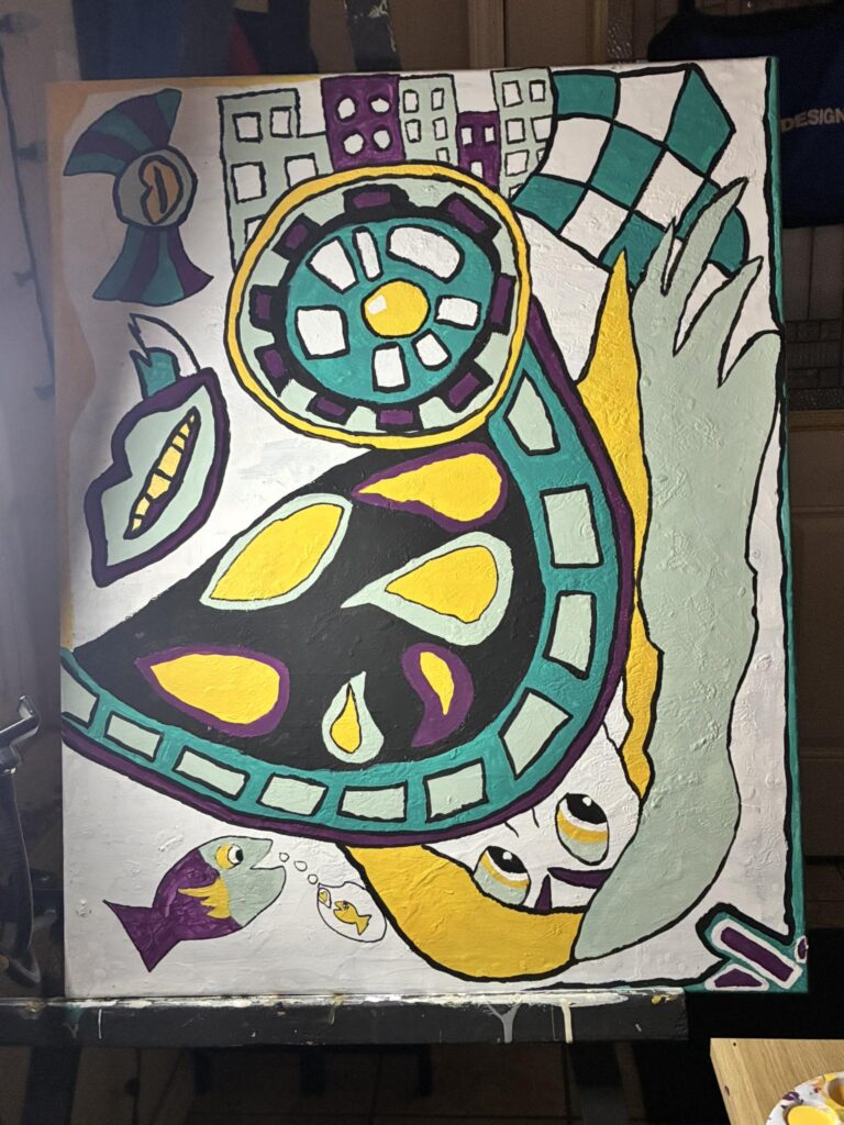
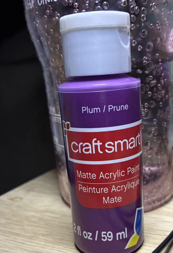
Personal Note: I create abstract art-🫶This is one of my pieces that’s still in progress…LOTS of color and eclectic pairings is my happy place…the plum color is a deeper version of what colors we are discussing in this post 👇
Decorating Isn’t Extra — It’s Expression
There’s a misconception that decorating is about embellishment. About “making it pretty.” About trends or themes or fitting into a box.
But for creative minds, decorating is translation.
It’s taking a feeling — calm, warmth, contrast, softness, richness — and letting color do the talking. It’s choosing restraint instead of excess. Depth instead of noise.
And that’s why the colors coming forward right now matter. Not because they’re “in,” but because they allow more nuance.
They don’t fight flavor.
They don’t overpower form.
They support the experience.
Let’s talk about them — not as trends, but as tools.
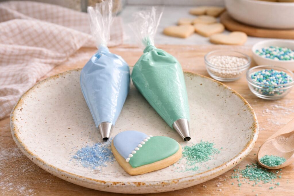
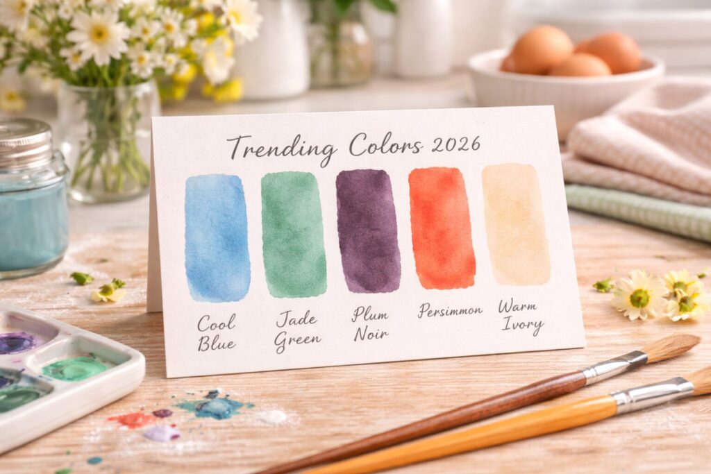
Cool Blue: Space, Breath, Clarity
Cool Blue doesn’t rush you.
It’s the color of pause. Of air between thoughts. Of space that lets other elements exist without competing.
On cookies, Cool Blue works when you want the design to feel intentional instead of sweet-forward. It has a way of quieting the noise so the shape, the line work, the balance can actually be seen.
Used sparingly, it:
- Creates contrast without sharpness
- Softens rich frosting visually
- Gives the eye somewhere to rest
Paired with warm-toned cookies, it creates balance — not contrast for the sake of drama, but contrast that feels natural. Like shadow against light.
Cool Blue doesn’t shout. It doesn’t perform.
It holds.
Jade / Eucalyptus: Grounded Creativity
Green is often misunderstood in baking. People think it has to be loud, minty, or novelty-based.
Jade and eucalyptus tones change that entirely.
These greens feel rooted. Thoughtful. Calm. They bring a sense of balance that works especially well when frosting is rich or sweet — because visually, they temper it.
This color lives comfortably in:
- Minimal designs
- Organic shapes
- Soft layering
It’s a color that lets texture shine. A slight variation in tone doesn’t weaken it — it strengthens it. Jade doesn’t need perfection. It thrives in subtle shifts.
It’s the color of confidence without excess.
Plum Noir: Depth Without Overstatement
Plum Noir is where things get interesting.
It’s deep, but not heavy.
Moody, but not dark.
Elegant without being formal.
This color adds gravity to a cookie design. It signals intention. Used as an accent, it draws the eye exactly where you want it — a line, a detail, a shadow, a contrast point.
What makes Plum Noir powerful is restraint.
It doesn’t need to cover the surface.
It doesn’t need to dominate.
A small amount goes a long way, especially when paired with lighter or warmer tones. It brings sophistication without removing warmth.
Plum Noir is the kind of color you use when you trust the viewer to feel rather than be told.
Persimmon: Warm Energy, Controlled Joy
Persimmon carries warmth without chaos.
It has energy, yes — but it’s grounded. It sits somewhere between brightness and restraint, which makes it incredibly flexible in decorating.
This color works when you want:
- Movement without loudness
- Warmth without sweetness overload
- A focal point that still feels balanced
Persimmon pairs beautifully with neutrals and deeper tones because it holds its own without overwhelming them. It adds life to a palette without demanding center stage.
It’s joy, but curated.
Persimmon color I created for this small yummy bite! 👆
Warm Ivory: The Quiet Anchor
Warm Ivory doesn’t ask for attention — and that’s exactly why it matters.
It’s the color that allows everything else to exist comfortably. It softens edges. It blends transitions. It keeps compositions from feeling rigid.
In frosting, Warm Ivory:
- Calms stronger colors
- Enhances texture
- Keeps designs from feeling stark
It’s also incredibly forgiving, which matters creatively. It allows room for movement, brush-like strokes, softness. It doesn’t require precision to feel intentional.
Warm Ivory is the foundation color — the one that supports without stealing focus.
Color Pairing Is Emotional, Not Technical
There’s no formula that replaces instinct.
You don’t choose colors because they “match.”
You choose them because they belong together.
Cool Blue next to Warm Ivory feels calm.
Persimmon next to Plum Noir feels rich.
Jade paired with neutrals feels steady.
Color pairing is about emotional balance — knowing when something needs grounding, when it needs contrast, when it needs rest.
And when frosting is rich and flavor-forward, color becomes even more important. It creates visual balance before taste ever arrives.
Cookies as Small Canvases
Cookies don’t need to be complex to be expressive.
A simple shape.
A controlled palette.
A confident hand.
That’s enough.
When color is chosen with intention, the design doesn’t need excess detail. It doesn’t need explanation. It stands on its own.
And that’s the point.
Decorating isn’t about impressing — it’s about translating what’s already happening creatively in your mind onto something edible.
Letting Color Lead (Without Overthinking)
If you think in color constantly — if your brain is always pairing, imagining, adjusting (like me!) — let that instinct lead your decorating.
Choose colors the same way you would on a canvas:
- Start with a feeling
- Limit the palette
- Trust restraint
You don’t need permission to use blue on a cookie.
You don’t need justification for a muted palette.
You don’t need trends to validate instinct.
Color already knows where it wants to go.🤗
Where Taste and Color Meet
At the end of the day, flavor matters most. Always.
But color sets the tone for how that flavor is received. It prepares the mind. It shapes expectation. It creates mood.
When color and taste work together — when neither overpowers the other — the result feels complete.
Not loud.
Not busy.
Just intentional.
And for creative minds, that’s where the real satisfaction lives — in making something that feels aligned, balanced, and honest from first glance to last bite.

You May Also Like
6 Dessert Trends That Will Upgrade Your Sweets in 2026